Lahso, l'Association de l'Hôtel Social, est une association lyonnaise. Ses actions se concentrent sur l'accueil de jour, la petite enfance, l'insertion professionnelle et le logement. Son engagement majeur est de préserver la dignité et le pouvoir d'agir des personnes accompagnées, plaçant "l'humain au cœur de l'action".
Lahso m’a contactée pour la refonte de leur identité graphique.
En effet, le professionnalisme de l’association ne se ressentait plus leur ancienne identité visuelle, avec un logo peu adapté aux codes graphiques actuels et un nom peu lisible.
Les objectifs de communication étaient :
- d’accroître la notoriété de l’association
- de faire passer Lahso dans une nouvelle ère graphique
- d’uniformiser l’ensemble des supports de communication
- d’être respecté et compris par les partenaires
- de développer la communication auprès du grand public
Lahso is a nonprofit organization based in Lyon, France, that offers daytime accommodation, early childhood support, vocational integration, and housing services. Its core mission is to uphold the dignity and agency of the individuals they assist, with a focus on placing "humanity at the heart of their actions."
Lahso reached out to me for the modernization of their visual identity. Their previous branding did not effectively convey the professionalism of the organization, with an outdated and not very readable logo.
The communication objectives were to :
- Increase the association's recognition
- Bring Lahso into a new era of design
- Ensure consistency across all communication materials
- Be respected and understood by partners
- Expand outreach to the general public.

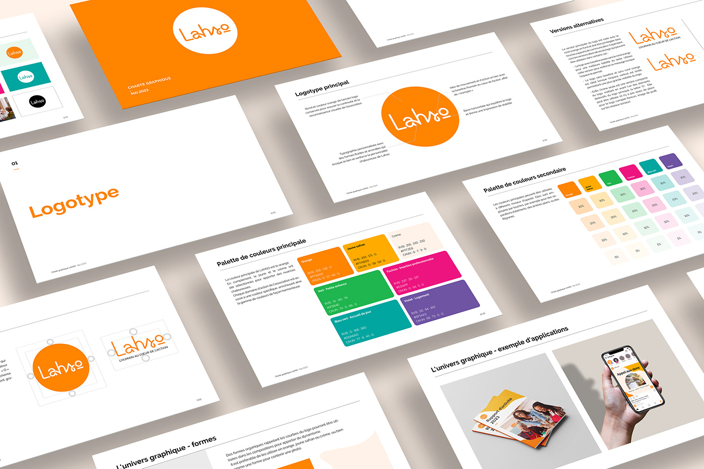
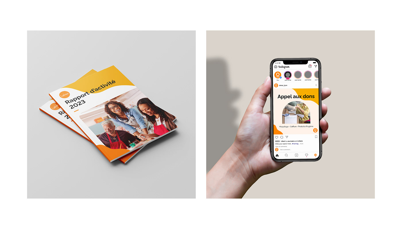
Les choix graphiques ont été élaborés pour refléter les valeurs essentielles de l'association : l’humanité, l’innovation, la proximité et la solidarité ainsi que sa personnalité accessible, humble et chaleureuse.
Pour le logo en lui-même, j'ai conçu une typographie sur mesure avec des formes fluides et arrondies. Cette typographie reflète le lien humain, renforçant ainsi la personnalité bienveillante de Lahso. La lettre "s" du logo évoque un tremplin, symbolisant la progression et l'élévation en accord avec la baseline "l'humain au cœur de l'action". La barre horizontale sous la lettre "o" dans le logo apporte un équilibre visuel et une impression de stabilité. Le rond et couleur orange de l’ancien logo ont été conservés pour assurer la continuité et la reconnaissance visuelle de l’association. Enfin, le choix d'utiliser des minuscules dans le logo traduit un sentiment de proximité, tout en permettant de se détacher de l'acronyme LAHSo pour créer un nom plus convivial et facile à prononcer.
The graphic choices were crafted to reflect the core values of the nonprofit organization: humanity, innovation, proximity, and solidarity, along with its accessible, humble, and warm personality.
For the logo itself, I designed a custom typography with fluid and rounded shapes. This typography embodies the human connection, further enhancing Lahso's compassionate identity. The letter 's' in the logo evokes a springboard, symbolizing progress and elevation in harmony with the tagline 'humanity at the heart of action. The horizontal bar beneath the letter 'o' in the logo adds visual balance. I kept the round shape and orange color from the previous logo to maintain the association's consistent look. Lastly, opting for lowercase letters in the logo conveys a sense of closeness, while also stepping away from the LAHSo acronym to craft a friendlier and more easily pronounceable name.


Les couleurs sont vives et contrastées, pour créer une ambiance positive et conviviale. L’orange fait le lien avec l’ancienne identité visuelle, tout en apportant de la modernité avec sa teinte plus saturée. J'ai attribué une couleur distincte pour chaque domaine d'action (petite enfance, insertion professionnelle, accueil de jour le logement).
The colors are lively and contrasting, contributing to a positive and welcoming ambiance. The use of orange maintains a connection to the previous visual identity while introducing modernity with its more vibrant hue. Additionally, a distinct color was assigned to each domain of activity (early childhood support, vocational integration, daytime accommodation, and housing services).